
After a few emails and a one to one meeting with the client, I put together the first rough (below) that incorporated the ideas we had discussed. The name of the poetry evening comes from 451 fahrenheit which is the temperature that paper starts to burn at, so it was agreed that heat or flame should be used in the image. An image of a poet holding burning paper didn't seem quite right, so we decided that a 'flaming brain' would be symbolically more interesting and could imply a burning intellect or passionate thinking, which better suited the subject matter.
 After watching a few poets perform, I realised just how different each individual's movements, vocal delivery and subject matter were. I knew I wanted the main image for the flier to be quite simple but still display a series of emotions and gestures. I felt it would be better to send a colour mock with the first pencil rough to give the client a better idea of how the arms and heads would look when they overlap. Below is the colour rough and as you can see it's very basic but conveys the idea well enough at this stage.
 Once the client had agreed to the first pencil rough and the colour mock, I started to draw up a neater pencil drawing adding some changes and fleshing out other elements that I had been asked to experiment with.
 I used the neater pencil rough to create a final colour mock so that we could see what works and what doesn't.
 The colour mock above helped us to identify areas that needed to be simplified and altered, for example; the microphone mesh, the brain swiggles and the swirling leaves. I was happy at this stage with the progress of the illustration, so I got to work drawing a logo that would complement the image. I didn't want the logo to be too distracting so I decided to keep it really simple and colourful.
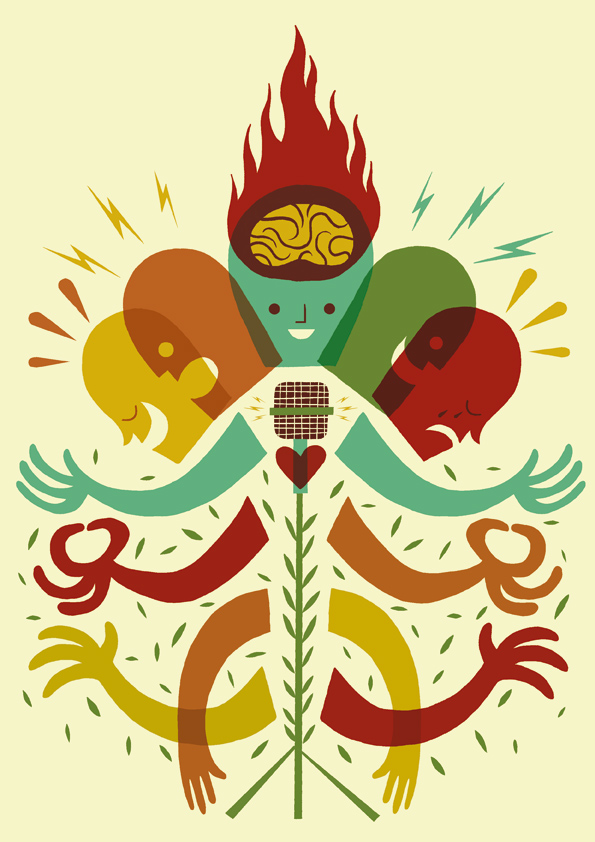
 Below is the final image that will be used on the flier. I've added texture and staining to the background colour so that it is no longer completely flat and the main figure has had a weathering effect added to it. Also, you may noticed that the second row of arms have changed their hand shape. It was felt that the meditating hand position may confuse the poetry evening with that of a spiritual event.

 After watching a few poets perform, I realised just how different each individual's movements, vocal delivery and subject matter were. I knew I wanted the main image for the flier to be quite simple but still display a series of emotions and gestures. I felt it would be better to send a colour mock with the first pencil rough to give the client a better idea of how the arms and heads would look when they overlap. Below is the colour rough and as you can see it's very basic but conveys the idea well enough at this stage.
 Once the client had agreed to the first pencil rough and the colour mock, I started to draw up a neater pencil drawing adding some changes and fleshing out other elements that I had been asked to experiment with.
 I used the neater pencil rough to create a final colour mock so that we could see what works and what doesn't. The colour mock above helped us to identify areas that needed to be simplified and altered, for example; the microphone mesh, the brain swiggles and the swirling leaves. I was happy at this stage with the progress of the illustration, so I got to work drawing a logo that would complement the image. I didn't want the logo to be too distracting so I decided to keep it really simple and colourful.Below is the final image that will be used on the flier. I've added texture and staining to the background colour so that it is no longer completely flat and the main figure has had a weathering effect added to it. Also, you may noticed that the second row of arms have changed their hand shape. It was felt that the meditating hand position may confuse the poetry evening with that of a spiritual event.
There you have it. From pencil scribble to full colour image. Thanks for reading and I hope it was interesting!
9 comments:
Thanks for that! Interesting and useful stuff.
Thanks for sharing that Ben ...
That was a really interesting insight into the process of your illustration work. Cheers Ben!
a good insight ;-)
I always like to understand the starting points of this kind of work. It has a real classic feel as well.
Good job and Thanks!
this was super-fantastically-duper-sparkle-rainbow interesting! what i mean is, i liked it. really neat layering.
Thanks everybody. I'm pleased it was useful.
Wow, great job, congratulations and greetings from mexico
Great stuff Ben, keep up the fine work!
Post a Comment