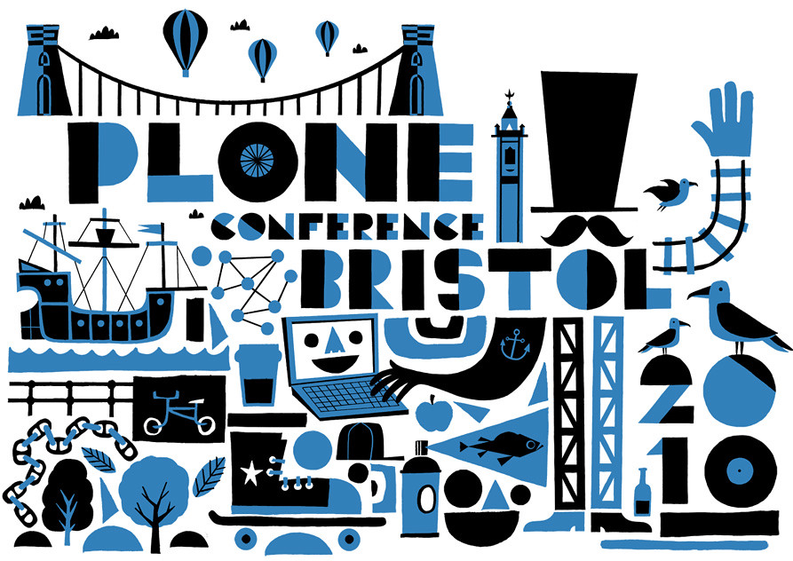
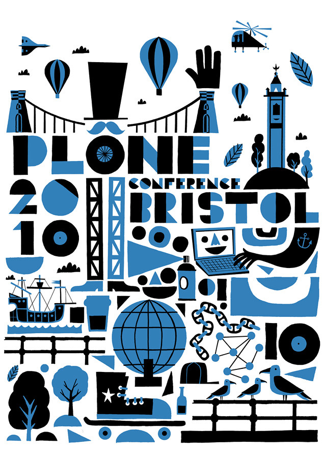
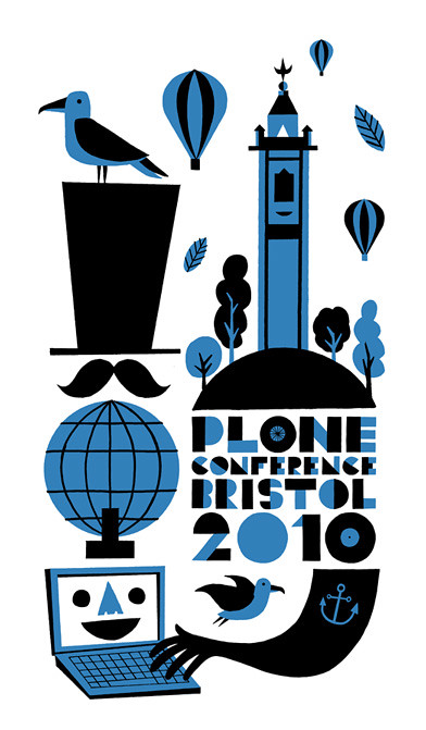
 Netsight Internet Solutions contacted me a few weeks back about designing a logo for the Plone conference they are hosting in Bristol. Netsight are a Bristol based company and as the hosts they wanted the logo to incorporate not just Bristol landmarks but also the city's quirks and cultural identity.
 I tried out numerous compositions ranging from very busy and cluttered to minimal and spacious. One of the things I really enjoyed about this job was that the client wanted the icons and graphics to be a little rough around the edges so it was great to loosen up and relax a bit. You can see how the logo was used for their website by clicking HERE.

3 comments:
Hey these are brilliant. Summing up Bristol in a logo is quite a challenge, but I think you have done an admirable job!
Beautiful work!
Thanks, guys.
Post a Comment