
 See here for exhibition details during the London Design Festival.
 See here for exhibition details during the London Design Festival.
 September 15th marks the opening of my new solo show 'Masks' at the Nobrow Gallery in London which will feature my mask designs from the last six months. The show opens just in time for London Design Festival and you can read more details on their website by clicking HERE. To make the event even more special I have enlisted the help of some very talented friends. In fact one of the collaborations is with my Father, Colin Newman but more details and pictures of that project nearer to the exhibition.
 This bad boy even has a big blue tail. SHAZAM!
 Boy oh boy, he is a handsome devil!
 A couple of weeks back, my Masks series was featured the the Guardian newspaper. Which came as quite a surprise..... a very good one. These prints along with a whole host of other prints and exciting projects will be exhibited at the Nobrow gallery from the 15th September. You find more details HERE.
 An illustration for an article titled 'How to BBQ with Science' in the famous 'how to' section in Wired magazine.


 This is my illustration of the now extinct Bishop's O' O' for the 'Ghost of Gone Birds' exhibition and will be available at the shows as a 21x21 cm screen print of 20 on wood and a 42x42 cm Giclee print of 40 on a 310g fine art felt paper. The aim is to help raise awareness and money for bird preservation societies so that hopefully we can stop more species of bird from becoming extinct. The first of a number of Ghost shows start this week at the Liverpool School of Art and Design on Thursday 19th and Friday 20th May. Over 80 artists and designers are taking part in the project including Ralph Steadman, Jamie Hewlett and many more.


 A little illustration for my agent, Pocko. All of the Pocko illustrators have designed a small image that works as a signature at the bottom of their emails. The images rotate at random from email to email. Pretty neat, huh?

 Here are some shots of the illustrations hung in the foyer. Thanks to Ashley May for his involvement in the project and for send the photos over.

 The brief for the drawing was to take any key moments from the past 30 years of pop culture and interpret them in my own way. I mainly drew inspiration from hip hop, punk, metal and Teen Wolf. The below pictures were taken by my friend and talented photographer, Pete Derrett. Pete dropped by to say hi and was a welcome break from the non-stop drawing. You can check out Pete's blog HERE.


 This last photo was taken by Neil at the end of the day to show everyone on Twitter the finished window. I highly recommend checking Schuh out. On top of the fact they sell lots of great shoes they also stock a good array of UK size 12 which is fantastic for me as I suffer from large feet and usually have a very limited choice for foot wear.
 A little while back Nobrow asked me to design their new packaging tape for their online orders to be wrapped in and here is the result. Alex from Nobrow asked me to illustrate a parade of animals all reading books in just two colours. Due to popular demand the tape is being sold on their online shop for £6.50 a roll but currently only a very limited amount is available. Click HERE to purchase the tape. Each roll is 66 metres in length and 5cm wide, the pattern is 40cm long and then repeats for the remainder of the tape's length. Below is a quick rough sketch of the design. Notice how quite a lot of the animals have changed places and the Bear and Gorilla have changed drastically from the first rough to the final full colour design.
 Here is the full 40cm design.
 Over the past two weeks, I've found time to work on a personal project and I finally feel genuinely excited and enthusiastic about drawing again. I've really enjoyed experimenting without any pressure and I have found that the ideas for other images in this series are starting to snowball. I'm taking a little break from working on them at the moment to concentrate on commercial work but this is the first half of a series of prints titled 'Masks' that will be available in the near future. Once the collection is complete they will all be sale at my solo show in September. Enjoy.
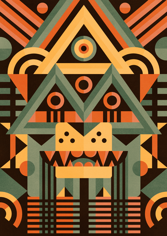


 Cent magazine asked myself and four other designers if we would like to create a sign for their latest issue. We had to create a sign that each of us felt was missing from the world. I chose to create a sign to endorse 'Public Displays of Affection' (PDA). I'm not talking about outdoor sex in public places or dogging in a layby, I'm talking about how nice it is to see people happy together and unafraid or embarrassed to show affection for each other in a world where bad news is reported at a premium. You can read my full explanation in the image below if you click on it. You don't have to but I thought I'd at least give you the option.

 The first pantone is yellow and I used the colour at 100%, 70% and a 40%.
 The highest opacity that I used the blue at was 85% due to a conversation with Rob Hunter about how dark the blue will print compared to how it appears on the computer screen. Rob had a pantone chart and the difference from screen to printed paper was quite significant. Losing the 15% knocked some of the intensity out which worked out for the best.
 Next up is red. It's really more of a pinky red than a deep red. By crossing it over with the yellow, the pinkish red gets boosted to a strong red. I think I only used the red at a maximum of 90% and a minimum of 20%.
 The blue and yellow create a green and the different shades of green are made by using different opacities of each spot colour.
 Here is the blue and red crossing over without the yellow. These two colours create a purplish secondary colour that highlights the dark areas of the image.
 For the gold spot colour to work at its best, it should not be over-layed or under-layed. Industrial litho printing is very, very accurate so I just cut the shapes to fit directly into the spaces. Here is an example of what it looks like without the other colours.
 Here is the finished illustration. It really made my brain blocks hurt but I feel very happy with the final result.
 Here is a photo of it in the latest issue. My digital camera is very old and very rubbish so this probably isn't the best representation of the printed article which is why you should go and buy it. It smells great too.
 Hope this was helpful. Toodles. x


